Announcing new-look notifications for Slack
Posted Mar 11, 2020 | 3 min. (529 words)We’ve had a lot of great feedback about our integration with Slack. Customers find it invaluable to have all the information about an error or issue delivered to a channel of their choice.
Using Raygun Crash Reporting or APM and Slack together, everyone involved is alerted to a problem, and an indication of the cause can be ascertained immediately. The appropriate person can then be assigned to complete the investigation and resolve the error or issue pronto.
No wonder it’s our most popular integration!
We’re happy to announce a completely new look for how error and issue notifications appear in Slack. We’ve made the alerts easier to read with emojis, added more contextual information by adding rule and condition details, and made long messages expandable, all so you can differentiate between alert notifications quickly and resolve problems faster.
What’s changing
There are three significant UI improvements that we have made to the Slack notifications for Raygun Crash Reporting and APM.
1. Emojis now make notifications more scannable
We first designed the Slack notifications to deliver all the information you’d need to resolve an error or issue. But they were sometimes quite long.
When we thought about the best way to break up separate issues, it made sense for us to introduce a visual element to help distinguish between the different types of alerts.
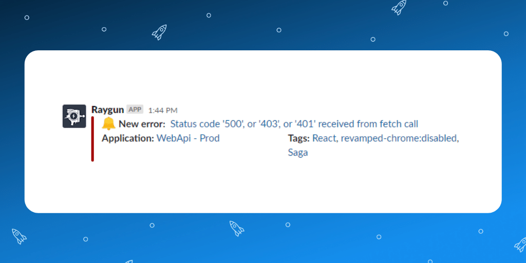
As Slack users ourselves, we know that emojis can convey the priority of an issue far more succinctly than text can. So, we introduced different emojis per alert type, so before you even read anything, you know what each alert is for. For example, when you see the 🔔 emoji, you know that there is a new error or issue occurring in your app. Here’s an example from Crash Reporting:

Here are the other emojis you’ll see:
-
🎉 This means the issue or error has been resolved. Congratulations!
-
🔔 A new issue or error has occurred
-
🔁 The error or issue has reoccurred
-
🔂 A gentle reminder that the error or issue is still reoccurring 5, 10, or 30 minutes later
-
👉 For listing APM issues when resolving
2. More context with added rules and condition details for APM
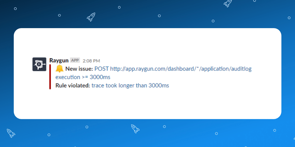
In addition to the redesigned UI, we’ve added better contextual information to the notification itself. Each rule and condition is now shown per issue. The example below highlights that the rule “method took longer than 1000ms” has been violated. The link will take you straight into Raygun so you can see the code-level details you need to resolve the problem:

3. Less noise with expandable notifications
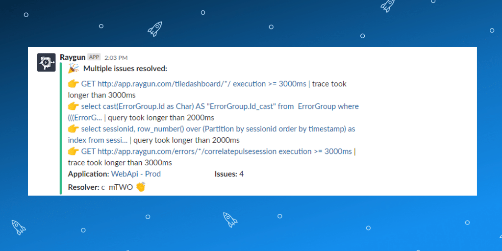
The Slack message that contains the errors or issues is now collapsed by default with a “show more” button at the bottom. In the screenshot below, an alert has been expanded to show us that there are several APM issues that have been resolved:

We’re always working to provide a better experience. With clear Slack notifications, it’s a lot easier to understand what’s going on in your app so you can solve problems faster. 🎉
What do you think of the new Slack notifications? We are always open to feedback, just send us a message, or find us on Twitter @raygunio.


